agepy.spec.coincidence.CoincMap
- class CoincMap(data, xedges, yedges)
Bases:
objectPlot a coincedence map and its projections on the x and y axes.
- Parameters:
- data: numpy.ndarray
2d array of shape (m,n) containing the coincidence map. In most cases this will be the output of
numpy.histogram2d().- xedges: numpy.ndarray
1d array of shape (m+1) containing the bin edges of the x-axis.
- yedges: numpy.ndarray
1d array of shape (n+1) containing the bin edges of the y-axis.
- Attributes:
- data: numpy.ndarray
Access the 2D histogram data.
- xedges: numpy.ndarray
Access the bin edges of the x-axis.
- yedges: numpy.ndarray
Access the bin edges of the y-axis.
- roi: tuple of tuples
Region of interest. Should be set using
set_roi().- fig: matplotlib.figure.Figure
Matplotlib Figure object. Created by the
plot()method.- ax: Sequence of matplotlib.axes.Axes
Sequence of matplotlib Axes objects containing the coincidence map, the projection on the x-axis and the projection on the y-axis and the colorbar.
Examples
>>> import matplotlib.pyplot as plt
>>> import numpy as np
>>> from agepy import ageplot
>>> ageplot.use("age")
Create some simple example data:
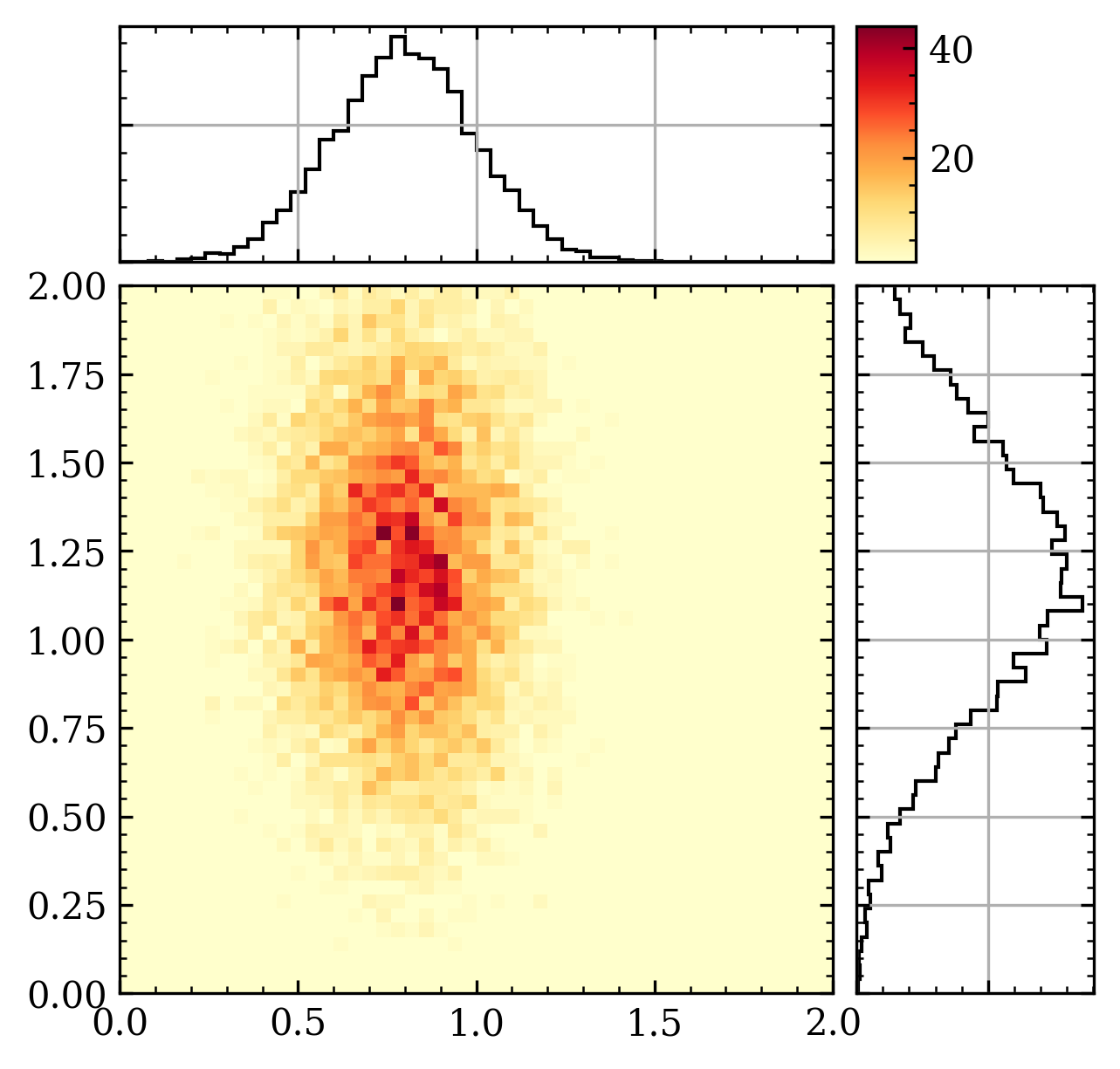
>>> xyrange = ((0, 2), (0, 2))
>>> n = 10000
>>> rng = np.random.default_rng(42)
>>> x = rng.normal(0.8, 0.2, size=n)
>>> y = rng.normal(1.2, 0.4, size=n)
>>> H, xedges, yedges = np.histogram2d(x, y, bins=50, range=xyrange)
Create a CoincMap object and plot the data:
>>> from agepy.spec.coincidence import CoincMap
>>> coinc = CoincMap(H, xedges, yedges)
>>> coinc.plot(figsize=(4.8, 4.8))
>>> # Start an interactive session with coinc.interactive()
Methods
Start an interactive PyQt session to view the data and add an ROI.
Create a matplotlib figure with the coincidence map and its projections on the x and y axes.
Set the region of interest (ROI) for the plot.
Update the plot with the current data and ROI settings.
- interactive()
Start an interactive PyQt session to view the data and add an ROI.
- plot(xlabel='early electron kinetic energy', ylabel='late electron kinetic energy', title=None, figsize=None, cmap='YlOrRd', norm=None, vmin=1, vmax=None, num=None)
Create a matplotlib figure with the coincidence map and its projections on the x and y axes. The figure is stored in the attribute
figand the axes inax.- Parameters:
- xlabel, ylabel
python:str,optional Labels of the x and y axes. Default: “early electron kinetic energy”, “late electron kinetic energy”
- title
python:str,optional Title of the figure. Default: None
- figsize
python:tuple,optional Figure size in inches. Default: None
- cmap
matplotlib.colors.Colormaporpython:str,optional Colormap passed to
matplotlib.pyplot.pcolormesh(). Default: ‘YlOrRd’- norm
python:strormatplotlib.colors.Normalizeorpython:None,optional Normalization passed to
matplotlib.pyplot.pcolormesh(). Default: None- vmin, vmax
python:float,optional - Minimum and maximum value for the colormap passed to
matplotlib.pyplot.pcolormesh(). Default: 1, None- num: int or str or matplotlib.figure.Figure, optional
Figure identifier passed to
matplotlib.pyplot.figure().
- xlabel, ylabel
- set_roi(xmin, xmax, ymin, ymax)
Set the region of interest (ROI) for the plot.
- Parameters:
- xmin, xmax
python:float Minimum and maximum value for the x-axis.
- ymin, ymax
python:float Minimum and maximum value for the y-axis.
- xmin, xmax
- Return type:
None
- update()
Update the plot with the current data and ROI settings.